5. Evaluation
To assess the musical suitability of the software applications developed during this research and the merit of the concepts underlying them, a formal evaluation was conducted along a number of fronts. Both miniAudicle for iPad and Auraglyph were subjected to user studies incorporating quantitative analysis via anonymous survey and qualitative appraisal through a number of concert performances. During the studies, automated logging of user activity was carried out via Google Analytics, to provide a data-driven aggregate picture of how individuals used these software applications. The author also spent some time composing music in Auraglyph for live performance, yielding an additional dimension of insight into the concept’s musical potential.
miniAudicle for iPad
The evaluation of miniAudicle for iPad was carried out in the form of a user study conducted with music technology students at the graduate and advanced undergraduate levels. These students were comfortable with ChucK, with music programming in general, and with various forms of music production and composition. The goal of the study was to validate the app’s design goals and draw conclusions as to the validity of the principles underlying them. It attempted to do this in the context of use by music technology students already familiar with the standard tools of the field and having diverse backgrounds in music composition and/or performance.
The user study for miniAudicle for iPad asked participants to use miniAudicle for iPad for a few hours over a period of a week. They were given the goal of developing a musical instrument, composition, or other creative work. Users were given iPads if they didn’t have one already, and the device was loaded with a specialized user study version of miniAudicle. This test version was tagged in the project’s code repository, which allowed the software to be continually developed while also ensuring that all users within the study received the same version of the app, regardless of when they started the study. Only the full-sized 9.7” variant of iPad was used for this study to control for issues related to the size of the screen and physical device. It was not logistically possible to control the exact model of iPad used for every individual, but each test device was of the 3rd generation model or better, having a minimum 1GHz CPU clock speed and a so-called “Retina” high-pixel-density display.
Before starting to use miniAudicle for iPad, participants filled out an entry survey to form a baseline of their musical and technical background. They were directed to a website hosting an introductory tutorial video, but were not required to watch the video. The site also included documentation and sample code for the ChucK Mobile API (described previously here). They were then left on their own for a week or so, during which point they would theoretically use the app over a period of days to develop a musical work. After a week, participants were asked to complete an exit survey which included a series of quantitative questions in which they could indicate their agreement on a scale of 1-5 in addition to prompts for short responses to qualitative questions. These surveys were linked through a pseudonym assigned to each participant at the start of the study but otherwise the survey process was anonymous. (Both surveys are included in Appendix [app:userstudy].)
After completing the survey, the participants were invited to demonstrate their results as a group with the author. All code and related resources created within miniAudicle for iPad during the user study were downloaded to the author’s computer for further analysis. Additionally, anonymous software-based usage tracking, using Google Analytics, was active throughout the study, to allow for later analysis of aggregate user behavior patterns within the app.
The qualitative component of the exit survey used a form of the Creativity Support Index developed by Cherry and Latulipe [1] with modifications inspired by Wanderley [7] and other alterations. The Creativity Support Index (CSI) assesses interactive software for creative applications according to the general characteristics of collaboration, enjoyment, exploration, expressiveness, immersion, and results being worth the effort. These factors are assessed by the user under study with two questions per category; using two similar but distinct questions for each factor is suggested as improving the statistical power of the survey. Then, the importance of each factor is indicated by the user with a series of paired-factor comparisons. These questions ask the user to indicate which of two of the above criteria they value more when performing the tasks indicated, for each pair of criteria. As a whole, the paired-factor comparisons establish a general hierarchy of importance of each factor. The final CSI is calculated as a single value, a linear combination of the users’ rating for each factor weighted by their deduced importance.
For this study, the collaboration factor was omitted in the survey, given the lack of collaborative aspects in the version of miniAudicle for iPad available at the time of the user study. An additional factor was added, learnability, inspired by Wanderley [7], who has argued “it is essential to take into account the time needed to learn how to control a performance with a given controller.” Further, the weightings of criteria by paired-factor comparisons were omitted to simplify the exit survey, which we considered acceptable, especially since we find the individual criteria rankings to be more interesting than an aggregate score.
Overall, 6 participants completed the user study. 33% of the participants stated that they used the app for approximately 4 hours, and the remaining 67% stated that they used the app for 5 hours or longer. The average user rankings of each criterion are summarized in Table 1.1.
| Factor | Average ranking (out of 5) |
| Enjoyment | 4.3 |
| Exploration | 4.25 |
| Expressiveness | 4.3 |
| Immersion | 4.1 |
| Results worth effort | 4.6 |
| Learnability | 4.6 |
The user study also solicited qualitative feedback from participants, with questions on the overall experience using miniAudicle for iPad and the creative possibilities that were enabled or closed off by the app. In their responses to these questions, participants expressed that they “enjoyed the performative aspects” of the application and appreciated being able to access the mobile device’s orientation sensors within ChucK code. Responses also indicated an appreciation of the “laid-back experience of not typing on a keyboard” and the ability to do ChucK programming while out and about and not sitting at a desk with a laptop or desktop computer; in one case, using miniAudicle for iPad was described as “fun” in contrast to full-time professional software development. Negative reactions focused on the lack of a traditional keyboard and the insufficiency of the code-writing tools supplementing the on-screen keyboard. One participant suggested that larger projects would be difficult or impossible to develop and manage, and several indicated that they saw the app more as for a tool for tweaking and performing code that had been written elsewhere. Another participant plainly stated that they “didn’t like coding in the iPad.”
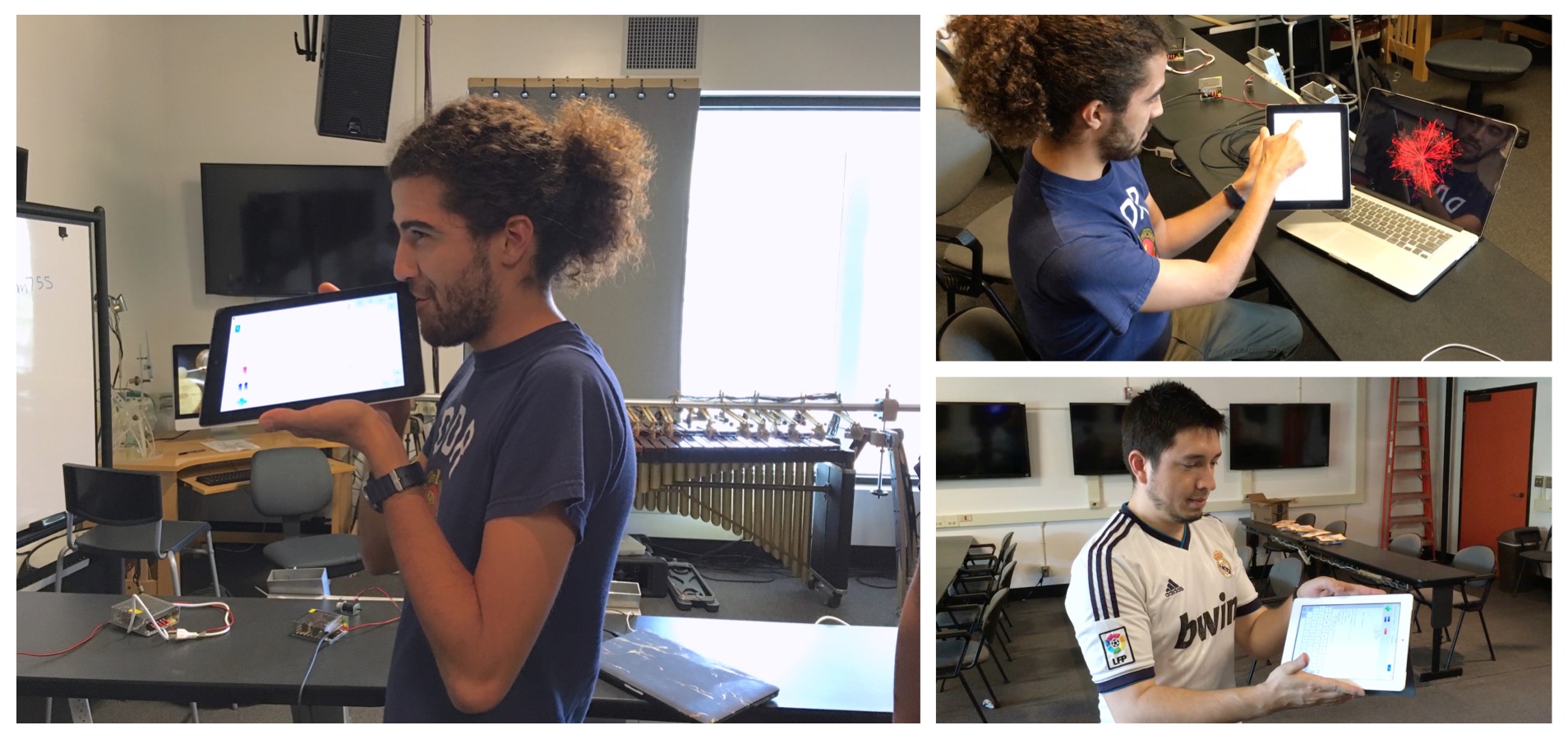
Among the creations presented at the end of the user study were a drone activated by voice or breath input fed into multiple delays, a feedback network driven by oscillators and controlled by motion sensors, an accelerometer-based shake controller for the Synthesis ToolKit’s “Shakers” physical model [2], a motion-controlled “cello,” and an audio analysis system that drove desktop-based visuals (Figure 1.1). A number of these leveraged the ChucK Mobile API to achieve these features, and in some cases leaned on the physical properties of the device itself for their interaction.
17 distinct user-generated code files were retrieved from the test
devices, encompassing 11948 total bytes of text and 467 non-whitespace
lines of code, or about 27 non-whitespace lines of code per file. Most
of these followed the while(true) structure that is
conventional to many types of ChucK programs, in which initial setup
code precedes an infinite loop that processes input and manipulates the
audio output accordingly. An example can be seen in Listing [listing:evaluation:chuck_user].
Loops were found in every program; functions were used occasionally, and
classes sparingly. One program was structured using a chubgraph [5] to
compose multiple unit generators and control code into a single
aggregate unit generator. Some of the programs were evidently modified
from the ChucK examples included with miniAudicle for iPad.
TriOsc c => NRev rev => Chorus chorus => dac;
SqrOsc s => rev;
0.6 => rev.mix;

0.35  => c.gain => s.gain;
400 => float sinfreq;

Motion mo;
MotionMsg momsg;

mo.open(Motion.ATTITUDE);

while(true)
{
    mo => now;
    while(mo.recv(momsg))
    {
        // <<< momsg.x, momsg.y, momsg.z >>>;
        momsg.x * momsg.x * 10000 => c.freq => sinfreq;
        sinfreq * 1.5001 => s.freq;
    }
}
Analytics
In advance of the user study, miniAudicle for iPad was outfitted with Google Analytics, a tracking tool for software applications. Within the app, usage data is fed to the Google Analytics software library, which compiles and uploads this data to the central Google Analytics service. As the developer of the application, we were then able to see the aggregate metrics for behavior and usage within miniAudicle for iPad. Filenames, ChucK code, or personally identifying information were not included in this usage data, but a given user is tracked across multiple sessions of application use.
| Event | Number of events of type | Percentage of total events |
| AddShred | 577 | 25% |
| RemoveShred | 528 | 23% |
| EditScript | 348 | 15% |
| ReplaceShred | 183 | 8% |
| EnterEditMode | 166 | 7% |
| ConsoleOpen | 95 | 4% |
| ShredsOpen | 62 | 3% |
| AppLaunch | 60 | 3% |
| ExampleScripts | 43 | 2% |
| MyScripts | 40 | 2% |
From a high level, user behavior can be categorized by “screen” or by “event.” For instance, miniAudicle for iPad tracks two screens, for “Play” mode and for “Edit” mode, and has many events, such as “AddShred” or “EditScript” (corresponding to an edit to a script). Screens are tracked by number of views as well as by time spent in that view. Events are tracked by quantity. Overall, these analytics provided concrete data about how participants used miniAudicle for iPad, complementing the survey data and musical demonstrations.
During the user study phase of miniAudicle for iPad, 6 unique individuals used miniAudicle for iPad over 47 total sessions. The average duration of using miniAudicle for iPad was approximately 15 minutes. 19 total scripts were created in these sessions.
According to the analytics data, users spent an average of about 7.2 minutes in Editor mode each time they activated that mode, and an average of about 1.7 minutes in Player mode (these will not add up to average session duration since each change in mode counts as a new “screen”).
Event tracking is summarized in Table 1.2. Users added a total of 577 shreds, comprising 25% of the total events; adding shreds was the most frequent event. Following it were removing shreds (23% of total events) and editing the script (15% of total events). (Individual script edits were not tracked; rather, an uninterrupted stream of edits punctuated by some other event were considered a single editing event.) Of the total shreds added, approximately 37% were added from Player mode, and 35% of the shreds removed were removed in Player mode. 11% of the shreds replaced were done so in Player mode.
Interpretation
We can start to form a number of interpretations of the results of this user study. It is encouraging that text editing on a keyboard was not completely unusable to participants in the user study. Additional enhancements to the editing component of the app might further ease the task of editing code on a touchscreen. On the other hand, the results of the user study also confirm that text editing on an iPad is not ideal for users. Its possible that no degree of small editing improvements will fully make text programming comfortable on a touchscreen.
Perhaps most contrary to miniAudicle for iPad’s design goals, Player mode did not seem to be especially engaging. Users on average spent 1 minute and 40 seconds in Player mode per session that they used it. This opposes the hypothesis that tangible interaction is the key element to working with ChucK code on a mobile touchscreen device. Rather, it seems that participants in the user study fundamentally viewed working with ChucK code in miniAudicle for iPad as a text-based process. In this sense, Player mode, as presented in the user study, was not sufficient to leverage touch interaction into a uniquely engaging programming experience.
However, users did seem to appreciate using miniAudicle for iPad as a versatile platform for prototyping software utilizing the sensors and physical aspects of the iPad. This speaks to the uniqueness of the iPad in terms of the sensors that are available and its form-factor in contrast with desktop computers. Future improvements to this system might put these capabilities in the foreground of the app and perhaps enhance them further.
Auraglyph
Evaluation of Auraglyph for its musical and artistic capabilities was carried out in two forms. The first was a pair of user studies conducted with students at California Institute of the Arts (CalArts). An initial user study was held with students of the CalArts course “Composing for Robots,” which consisted of a specific task for the participants to complete using Auraglyph followed by a survey of their experience using the software. Following the survey, this evaluation was extended to have the students develop concert works for Auraglyph in groups of three or four. A second user study was conducted in a two week intensive workshop at CalArts, entitled “Composing with Mobile Technology.” This study used a similar approach to the previous study but in a compressed span of time.
In between the two user studies was a period of continuing development of Auraglyph based on user feedback from the first study and the author’s own evaluation of the software. Therefore the two studies have not examined the exact same software; rather, the second study evaluated a form of Auraglyph that was intended to be an improvement of the initial study version. The primary goal of these efforts was not to evaluate a specific edition of the Auraglyph software, but to assess its underlying concepts and the ideas described in Chapter [chapter:sketching].
The other form of Auraglyph’s evaluation centered around the author’s attempts to use the software in an artistically significant manner. Music software can make the creative process more accessible or provide a breadth of aesthetic opportunities, but we also believe that sophisticated music applications can offer a depth of creative experience. Acoustic instrumentalists spend years honing their craft, and, while music technology has removed many of the limitations of the pre-digital age, there is still a need for tools that engender the continuing development of skill and proficiency. This additional form of evaluation is intended to gauge Auraglyph in that context.
Auraglyph Study 1: Composing for Robots
In autumn 2016, students in the author’s CalArts course “Composing for Robots” participated in a user study for Auraglyph. The study was structured in two main parts, the first consisting of individual use with quantitative analysis and the second involving groups of the students using Auraglyph to compose concert works.
The first part resembled the miniAudicle for iPad study discussed previously. Participants in the study were given iPads with Auraglyph installed or, in some cases, Auraglyph was installed on iPads they owned themselves. They were each given the task of individually creating a “musical statement” using Auraglyph. After one week of using Auraglyph independently, they were asked to demonstrate their results, describe their experiences, provide feedback as to the design of the software, and complete a short survey.
The initial musical results, after one week of use, were somewhat basic in sound design and form. Yet the students maintained a high degree of enthusiasm around the potential offered by Auraglyph. At the one week point, participants stated that they enjoyed the sketching metaphor of the application and the ability to capture their sonic stream of consciousness, and overall felt the basic functions of the software were intuitive. The chief criticism of the software at this stage was a slow learning curve and lack of resources for explaining the core functions of the application. Reliability was also noted as a concern, as certain user actions would consistently crash the application or put the application into an erroneous state. Other criticism centered on the absence of several critical ancillary features, like the ability to save an existing Auraglyph program, to create a new one with a clean slate, or to load a previously saved program (these features were not present in the version of Auraglyph tested). The inability to undo mistaken actions or copy and paste structures was also cited as a significant limitation. Participants expressed a desire for additional node types, such as more advanced math and signal processing functionality. Additional feedback included a desire for the niceties of typical digital audio workstations, such as node solo and mute functions.
| Average ranking (out of 5) | ||
| Factor | Auraglyph | miniAudicle for iPad |
| Enjoyment | 3.6 | 4.3 |
| Exploration | 2.7 | 4.25 |
| Expressiveness | 2.9 | 4.3 |
| Immersion | 2.4 | 4.1 |
| Results worth effort | 3 | 4.6 |
| Learnability | 4.6 | 4.6 |
As with the miniAudicle for iPad study, the survey asked participants to evaluate the software according to a modified form of the Creativity Support Index. Seven total students participated in the study, and five of these completed the survey (the survey text is included in Appendix [app:userstudy]). One of these seven students had previously participated in the miniAudicle for iPad user study described above. The average rankings for each modified CSI criterion are shown in Table 1.3 alongside the rankings from the previous miniAudicle for iPad study. To the surprise of the author, these fell significantly short of the comparable rankings for miniAudicle for iPad. Respondents stated that “[w]hen it worked, it was fun to push up against the limitations of the software” and that it was “[a] fun way to build systems.” On the negative side, feedback included that “a lot of times it felt like it was a fight against the interface,” “I just had some frustrations with crashes,” that “[t]he UI is a little confusing,” and that it was “hard to figure something creative out on my own” beyond basic oscillators. Respondents also expressed a desire for additional educational resources, such as a video tutorials or example programs.
Some early conclusions can be drawn from this feedback and the accompanying modified Creativity Support Index scores. One is that reliability is incredibly important for creative software to achieve its goals. Another is that documentation resources are critical for helping users achieve the full potential offered by a creative application. Notably, negative feedback from the surveys primarily focused on implementation issues such as crashing or unreliability; these issues ultimately have straightforward engineering solutions. Auraglyph’s comparatively poor performance in this initial study was not viewed as an indictment of its design or of its underlying metaphor.
Analytics software was running throughout the two weeks between introducing Auraglyph to the students and distributing the survey. During this period, seven individuals used Auraglyph over 48 sessions. The average session duration was 21 minutes. Twelve sessions (25% of the total in this period) lasted longer than 30 minutes, and these extended sessions averaged 45 minutes in length.
| Event | Number of events of type | Percentage of total events |
| EditNodeParamSlider | 2,397 | 22.68% |
| MoveNode | 1,992 | 18.85% |
| OpenNodeEditor | 1,391 | 13.16% |
| DrawNodeUnrecognized | 1,354 | 12.81% |
| ConnectNodes | 1,124 | 10.63% |
| DrawNodeCircle | 457 | 4.32% |
| CreateNodeAudio | 397 | 3.76% |
| DeleteNode | 290 | 2.74% |
| SaveProgram | 173 | 1.64% |
| DrawNodeSquare | 157 | 1.49% |
Table 1.4 summarizes the most frequent user activities that were tracked during the study. The most common events were adjusting parameters of nodes using sliders and moving nodes. Drawing an unrecognized figure that was intended to be a node (DrawNodeUnrecognized, 12.81%) was nearly three times as common as drawing a recognized node (DrawNodeCircle, 4.32%, and DrawNodeSquare, 1.49%), indicating significant problems in accurately detecting these figures. The least common event was drawing the numeral 7, which was successfully achieved only once during the study.
| Audio node | Nodes created | Percentage of total audio nodes |
| SineWave | 59 | 14.86% |
| Multiply | 58 | 14.61% |
| Feedback | 41 | 10.33% |
| Waveform | 37 | 9.32% |
| SquareWave | 28 | 7.05% |
| BandPass | 24 | 6.05% |
| Input | 22 | 5.54% |
| Output | 22 | 5.54% |
| SawWave | 21 | 5.29% |
| ADSR | 20 | 5.04% |
| LowPass | 20 | 5.04% |
| Add | 19 | 4.79% |
| TriWave | 16 | 4.03% |
| HiPass | 6 | 1.51% |
| Compressor | 4 | 1.01% |
Table 1.5 shows a breakdown
of audio nodes created by users during the study. SineWave
and, curiously, Multiply were the most frequently used
nodes during the study (Multiply can be used either as a
simple gain control or to multiply its inputs as in a ring modulator).
Feedback and Waveform (a hand-drawn wave table
generator) were also common. ADSR was used somewhat
infrequently compared to other nodes, suggesting that participants were
not especially concerned with applying envelopes to their sounds.
Composing for Robots Concert
Following this initial study, the students of “Composing for Robots” continued individual use of Auraglyph and then transitioned into developing group compositions for the course’s upcoming final concert. Hemispherical speakers and subwoofers were loaned by the Stanford Laptop Orchestra [9] to supplement the built-in iPad speakers for the concert. Given additional time to work with Auraglyph, the students appeared to become more comfortable with its various features, which manifested in improved musical output.
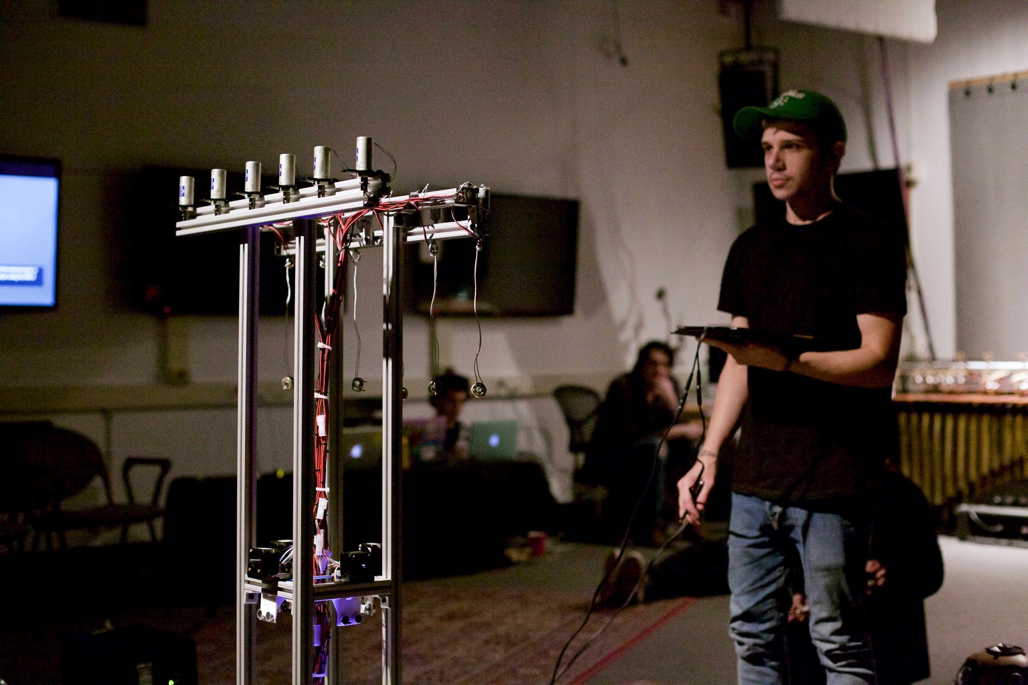
The Auraglyph x Robots concert occurred in late Autumn at CalArts and comprised several musical works developed in “Composing for Robots.” These included two group compositions that utilized Auraglyph and a number of pieces for the mechatronic instruments of the CalArts Machine Orchestra [4]. Figure [fig:evaluation:agconcertmontage] shows several of the works in performance and the poster advertising the event. One of the pieces used Auraglyph to build a spatialized beat across three hemispherical speakers arrayed in the performance space. The performers improvised with sequencers and other controls to progress the piece as it built up and waned over time.

In the other Auraglyph-based piece, titled HedonismBot, the group developed three feedback-based musical instruments in Auraglyph and used these in tandem with the titular mechatronic instrument. The instruments were based on processing and replaying the iPad’s microphone input, and each possessed a unique sound design, covering distinct pitch registers and timbral spaces. The piece’s three performers held their instruments in various orientations around the hemispherical speakers to which the iPads were connected, creating acoustical feedback loops. At set points within the composition, each performer would walk up to HedonismBot, in the middle of the stage, and present their iPad, which triggered the bot to actuate a pattern of motorized clicks and whirs (Figure 1.3). Feeding into the Auraglyph instruments’ input processing, these sound patterns became increasingly elaborate as the piece progressed. Parts of the feedback loops were controlled with input from the iPad’s orientation sensors. As the performers adjusted their tablets deliberately and moved back and forth from their associated speaker to the robot, the overall impression was that of a musical ritual. The piece not only created a unique musical texture but engaged its musical objects and the performance space in ways uncommon in electronic music. It would not have made sense if, for instance, laptops were used instead of iPads, or if the distinct audio sources had been mixed into a common sound system.
Auraglyph Study 2: Composing with Mobile Technology Workshop
In winter of 2017 the author held a two-week workshop at CalArts entitled “Composing with Mobile Technology.” The workshop was focused on developing music and compositions using miniAudicle for iPad, Auraglyph, and other selected applications for mobile phone and tablets. This workshop started a month after the Composing for Robots class, and the feedback and data received from the previous exercise suggested improvements to the Auraglyph software that were completed before the workshop. These additional features included support for multitouch interaction (including the ability to adjust multiple parameters of multiple nodes simultaneously), support for saving and loading programs and easily creating new ones, a noise generation node, and a variety of fixes addressing bugs and crashes. These were expected to improve the overall process of working with Auraglyph and ultimately lead to a better music making experience.
miniAudicle for iPad and Auraglyph were presented on separate days, and students were asked to develop short musical statements in each during class time. For the final class assignment, students were asked to develop and perform a full composition. Students in the workshop gravitated heavily towards composing with Auraglyph, with some students stating that that was the reason they took the class. This in itself constitutes a substantial, if informal, finding of the study, in that, when presented with both miniAudicle for iPad and Auraglyph without experience in either, participants strongly preferred working with Auraglyph. As a result the workshop provided a wealth of data for evaluating Auraglyph’s performance with a number of users.
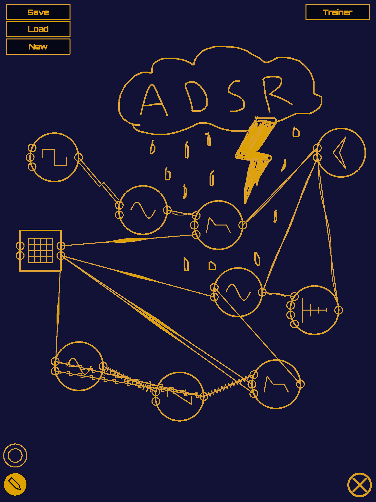
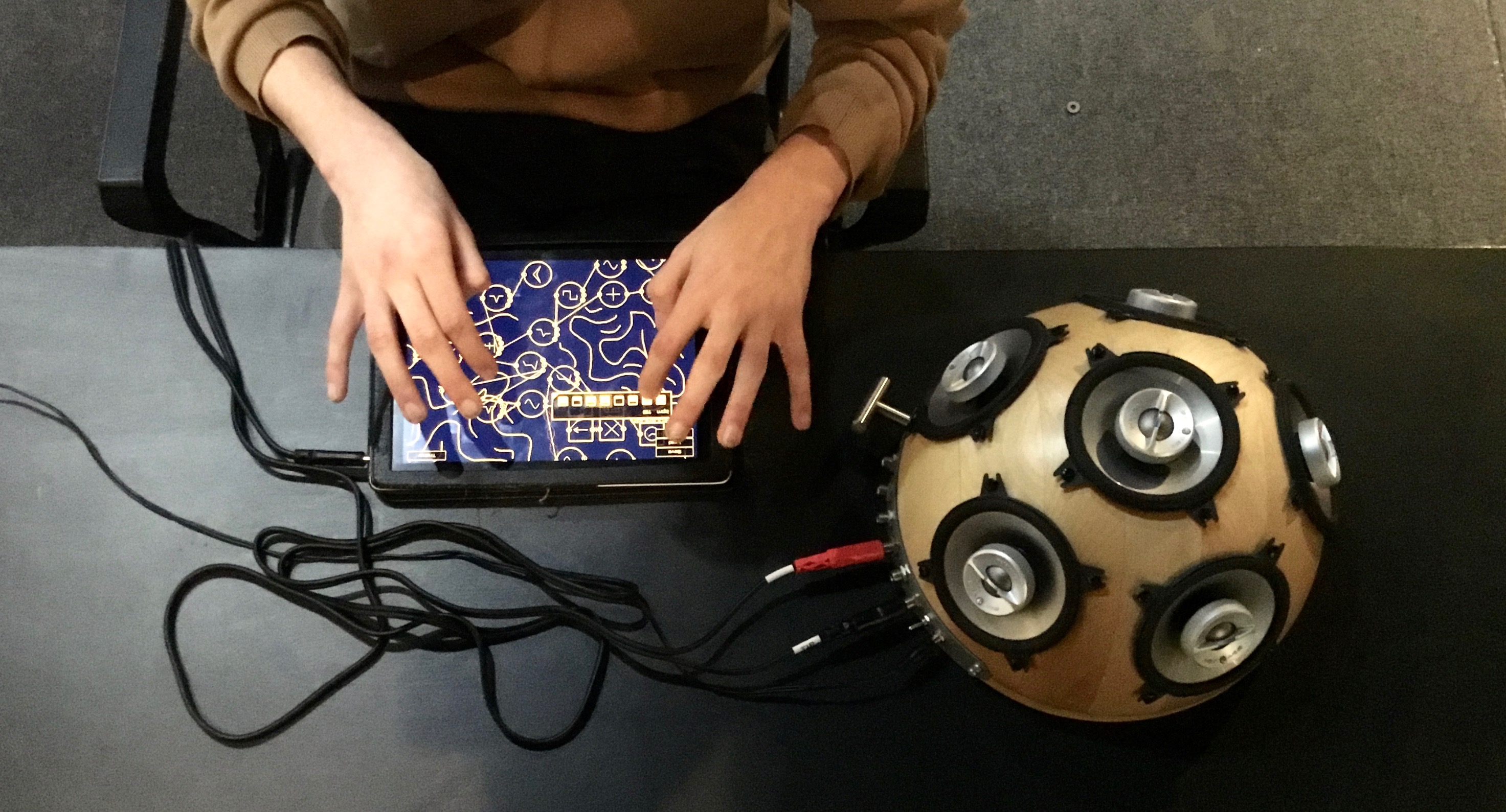
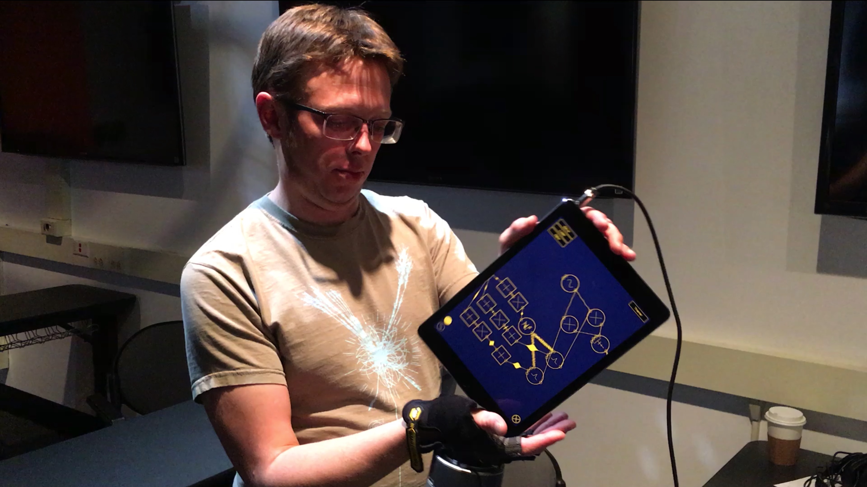
14 students total participated in the workshop. One of these students had previously participated in the initial Auraglyph user study, and none had been involved in the miniAudicle for iPad study. Most of these were students in CalArts’ Music Technology program, and thus had a high degree of familiarity with many existing digital music creation tools. After demonstrating how to use Auraglyph to the students, installing it to their iPads, and providing class time to spend developing music with the app, the classroom developed over the next hour into a diverse soundscape of drones, beats, blips, and other noises. One student immediately set out to create a kick drum using an enveloped triangle wave and noise generator. Another student built a cascade of sequenced delays; by varying the sequence, he was able to explore a variety of sonic spaces (Figure 1.4). Students explored the freedraw feature of Auraglyph, using it less as an annotation mechanism and more as a way to customize and embellish their programs (Figure 1.5). One student began prototyping ideas for notating instructions to Auraglyph performers (Figure 1.6). A number of experiments centered around using the iPad’s orientation sensing capabilities for manipulating sound (Figure 1.7).
In class, many of the students seemed completely absorbed in the process of making music with Auraglyph, with heads buried in tablets, fully engaged in this world of sound creation. Outside of class, several students reported that they had stayed up until the early hours of the morning using Auraglyph, despite the workshop not mandating coursework outside of class time.1 It was surprising to see that students were freely exploring the sonic possibilities of Auraglyph without necessarily having a concrete long-term goal. At times, it seemed the effect of composing with Auraglyph was hypnotic or even therapeutic, especially given the external events and tumultuous American political climate in late 2016 and early 2017.
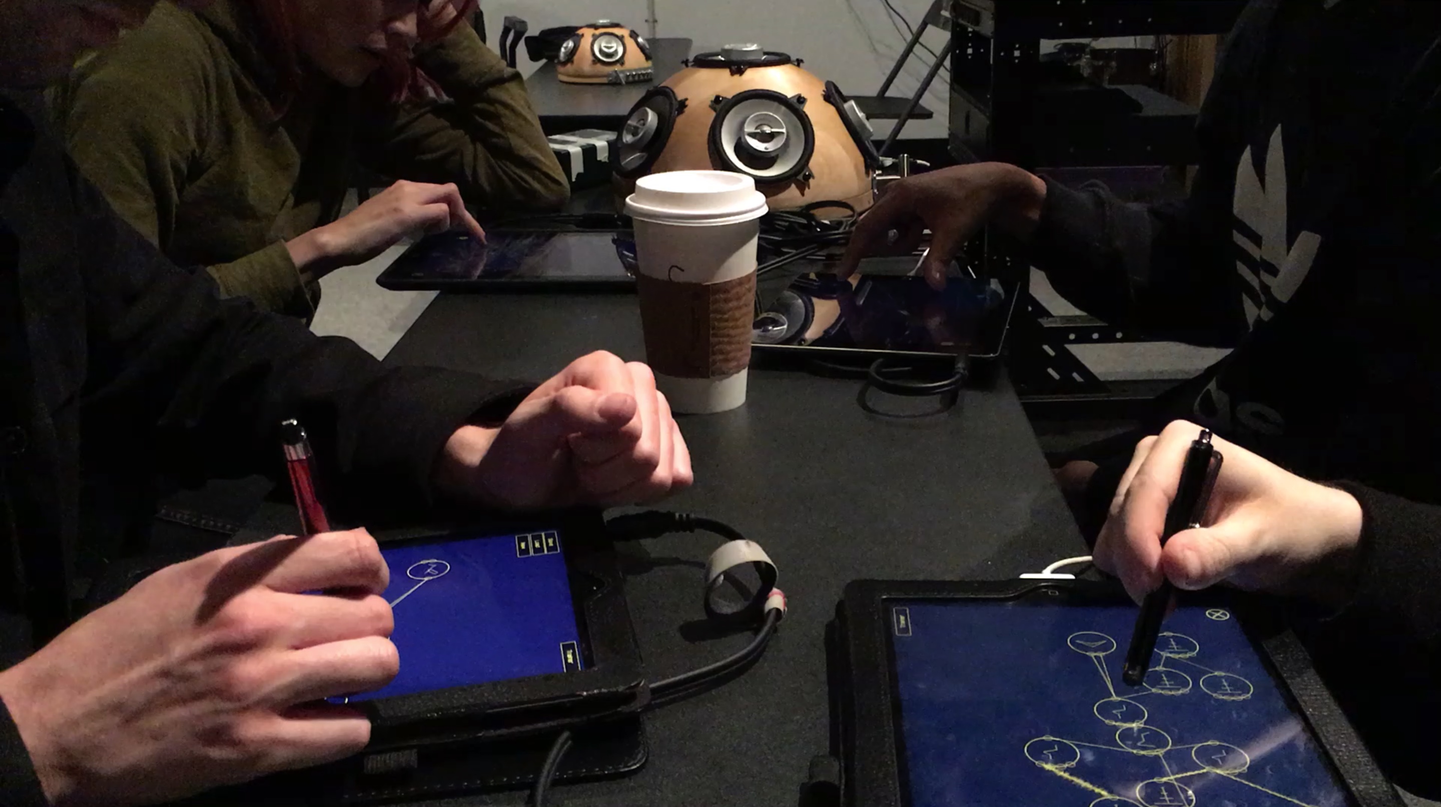
Ultimately six performances were presented at the end of the workshop, including solo and group performers. In addition to the final works a number of interesting demonstrations and musical statements were also developed by participants in the workshop. One of the final performances involved a quartet of performers each using Auraglyph on separate iPads, distributed to two hemispherical speakers (Figure 1.8). The quartet performed a rhythm-driven piece, despite there being no intrinsic capabilities for synchronizing instances of Auraglyph across multiple devices. This didn’t appear to be a critical limitation, as the fluid rhythmic interplay of the result lent itself to the overall dynamic nature of the music. A solo composer developed a work that explored a number of different sonic spaces, fluidly shifting through a multilayered texture of droning oscillators, a cacophonous swell of noise, and an industrial-style percussion beat. (Notably, at this time, Auraglyph did not support playing back soundfiles; the percussion in this piece was entirely synthesized from manipulating oscillators and noise.) He intended to develop the piece further for presentation at a future concert. Another student developed a piece for Auraglyph, electric guitar, and several other mobile devices running additional music software, building a dense soundscape over which he improvised with each tool.
During and after the workshop, the author spoke directly with a number of the students to informally solicit their reactions to and criticisms of working with Auraglyph. One student appreciated that the “app promotes destructive creativity” with the ability to “throw oscs into oscs into more oscs,” fostering “a mindset where you’re not going to make this harmless thing.” Another student stated that they had no previous experience with musical apps for iPad, but they liked that Auraglyph was a “real playable thing” and a “nice way to visualize synthesis.” One stated that it “felt right on the iPad,” while also identifying several drawbacks; these included limited tools for managing size and complexity of programs and the inability to assemble synthesis structures into reusable modules. A number of students expressed fear of the “Save” button, worried they might accidentally hit the nearby “New” button instead and lose their work. One of the workshop participants stated that he could “do that for hours,” also saying how he “really learned a lot about sound synthesis” and compared it favorably over Native Instruments’ Reaktor. One, after presenting a completed program to the author, stated that he wanted to hang it up on the wall as a work of art. Several students purchased new iPads during the workshop or soon afterwards, inspired in part by the musical creativity they had felt working with Auraglyph and miniAudicle for iPad during the workshop. Students with a background in analog modular synthesis seemed to take well to Auraglyph, though this was not exclusively the case. Several students had very limited exposure to music technology beyond digital audio workstations and music notation software, but this did not seem to inhibit them from expressing a range of creative ideas in Auraglyph. Students who had previously struggled to fully realize their ideas using ChucK in the author’s prior Introduction to Programming classes produced some of the best compositions in the workshop with Auraglyph.
| Average ranking in study (out of 5) | |||
| Factor | Second Auraglyph | First Auraglyph | miniAudicle for iPad |
| Enjoyment | 4.8 | 3.6 | 4.3 |
| Exploration | 4.2 | 2.7 | 4.25 |
| Expressiveness | 4.3 | 2.9 | 4.3 |
| Immersion | 3.9 | 2.4 | 4.1 |
| Results worth effort | 4.8 | 3 | 4.6 |
| Learnability | 4.6 | 4.6 | 4.6 |
11 participants of the workshops completed a survey provided after the first week of the workshop. This survey was a copy of that used in the Composition for Robots study and is included in Appendix [app:userstudy]. The average user rankings of each criterion for the modified Creativity Support Index are summarized in Table 1.6, along with the rankings from the previous studies. Compared to the Composing for Robots study, each factor improved markedly except Learnability, which was already fairly high. Immersion ranked much lower than every other factor in this study; this might suggest either lingering reliability issues or perhaps a limit to the engagement of Auraglyph’s metaphor, as implemented. As with the previous studies, it is likely that the overall positive skew of the results was due in part to the participants’ personal relationships with the author, even though the anonymity of the results was stressed when distributing the survey.
The freeform responses to the survey also proved illuminating. Users enjoyed using Auraglyph for sound design and “just for creating new and innovative sounds,” the modular aspect of its design, the visual design, and seeing “the different waves going all around.” One responder stated “[i]t was a lot easier for me to get started with than programming languages like Pd, SuperCollider, etc,” while another commented that “I just make music. I just want to keep going. It sounds good. I’m not thinking about EQing or any annoying DAW shit.” Criticism of Auraglyph in the survey focused on the absence of traditional musical timing mechanisms, the inability to encode conventional musical ideas and notation, and the anticipated difficulty of playing an extended live set. Reliability issues were also a concern, especially surrounding saving and loading programs.
| Event | Number of events of type | Percentage of total events |
| EditNodeParamSlider | 6,651 | 25.26% |
| DrawNodeUnrecognized | 4,584 | 17.41% |
| MoveNode | 4,483 | 17.03% |
| OpenNodeEditor | 3,594 | 13.65% |
| ConnectNodes | 2,381 | 9.04% |
| DrawNodeCircle | 1,079 | 4.10% |
| CreateNodeAudio | 882 | 3.35% |
| DeleteNode | 482 | 1.83% |
| DrawNumeralUnrecognized | 293 | 1.11% |
| EditNodeParamDrawOpen | 272 | 1.03% |
As before, analytics were active for the duration of the workshop. Google Analytics tracked 13 individual users across 89 sessions of using the app in the two week duration of the workshop (some workshop participants shared iPads resulting in their being tracked as a single user). The average session duration was 20 minutes; 24 sessions lasted 30 minutes or longer, these longer sessions averaging approximately 45 minutes. A breakdown of ten most common user activities is broken down in Table 1.7. The most common event type was editing a parameter with the touch slider. The second most common event type was drawing a shape that was not recognized as a node, pointing at fairly egregious reliability issues with the handwriting recognition implementation and a place for significant future improvement. Audio nodes were the most commonly drawn node type. The most frequently drawn numerals were 0 and 1, both drawn 92 times; however, attempts to draw a numeral that was unable to be recognized were more frequent. 188 individual free-drawn figures were drawn, encompassing 0.71% of user actions during the study. The least common tracked user action was drawing the numeral 7.
| Audio node | Nodes created | Percentage of total audio nodes |
| SineWave | 208 | 23.58% |
| Feedback | 116 | 13.15% |
| SquareWave | 92 | 10.43% |
| ADSR | 73 | 8.28% |
| TriWave | 66 | 7.48% |
| SawWave | 62 | 7.03% |
| Waveform | 49 | 5.56% |
| Multiply | 43 | 4.88% |
| LowPass | 41 | 4.65% |
| Output | 34 | 3.85% |
| Noise | 29 | 3.29% |
| Add | 21 | 2.38% |
| Input | 15 | 1.70% |
| BandPass | 11 | 1.25% |
| Compressor | 10 | 1.13% |
| HiPass | 10 | 1.13% |
| Composite | 2 | 0.23% |
Table 1.8 provides a summary
of the audio nodes created during the workshop. 882 total audio nodes
were created, with SineWave being the most common by far.
Feedback and SquareWave were both also fairly
common. At least one of each kind of node was utilized by a participant
during the workshop, including the Composite node, an
unfinished feature which was unintentionally left in the software build
used during the workshop.
Personal Evaluation
The development of the Auraglyph software was interleaved with periods of extended composition using the latest build of the software. These composition sessions were initiated at appropriate milestones in the software’s development. The sessions were used to reflect upon the current state of the software and to guide further development, in terms of high-level design, individual features, and the triage of critical bugs.
In this sense Auraglyph was constantly being evaluated for its musical potential by the author in an iterative loop of development and use of the software. This feedback loop of constant iterative development was carried over from the author’s work with Smule [8], in which a number of sonic application experiments were developed in a matter of months; in one extreme case, an entire Smule application was conceived, developed, and submitted to the iPhone App Store within a single day. These development cycles were informally broken into shorter sprints of heavy development followed by use and evaluation of the current state of the application. Creative software of an experimental nature requires this iterative development process to quickly evaluate a variety of design concepts of unknown utility, guiding them into usefulness or discarding them entirely. Such processes are also integral in the now-common situation where a single individual is the builder, composer, and performer of a musical software and/or hardware tool.

A number of milestones in the development of Auraglyph triggered
intense periods of composing with the new feature that had just been
implemented. For instance, the completion of scrub controls of the node
parameter editor, which allowed parameters to be adjusted easily and
directly with touch, inspired creating the first public presentation of
Auraglyph, a demonstration video2 (Figure 1.9) uploaded to YouTube which
garnered several thousand views and attention from the online software
synthesis community.3,4 The
addition of proper multitouch interaction, such as the ability to scrub
multiple node parameters at the same time or connect multiple nodes
simultaneously suggested further possibilities, including multi-user
interactions. The implementation of a number of nodes seemed to multiply
the sonic potential of Auraglyph. After adding the Feedback
node, the author spent the rest of the evening exploring the newly
available possibilities for echo, spatialization, and modulation effects
with varying parameterization and inter-node connections. Adding
Noise triggered similar experimentation with the musical
potential of random noise.
In autumn 2016, the author was invited to perform at a student-initiated concert, TOO LATE IV, and decided to use Auraglyph to compose and perform 20 minutes of original electronic music for the event. This would be the first instance of the author actually producing a musical composition using Auraglyph; previously only short musical demonstrations or test programs had been created. This opportunity was seen as an initial experiment to see if the current version of Auraglyph could be used to create an interesting, satisfying, and/or listenable music experience for the author and an audience. It was not completely certain at the time if that would be possible, given the current state of the software, its creative affordances, and concerns about reliability. Given these concerns, the experiment was viewed as another step in the iterative development process, whose results and conclusions would be used to guide continued refinement and improvement of Auraglyph.
This compositional process transpired over a period of two weeks, resulting in two compositions of roughly ten minutes in length. The original intention was to use two iPads, each with Auraglyph installed, and alternate between the two, creating a richly textural, continuous musical experience. miniAudicle for iPad was also considered for adding small sonic elements to the mix. The end result reduced this setup to a single 12.9” iPad Pro preloaded with two Auraglyph programs that would be reconfigured and augmented over the course of the performance. Each patch roughly corresponded to one “song.”
The first song, DRONE, was a fairly simple piece progressing through layers of amplitude and frequency modulation at high and low rates, applied to oscillators tuned in various registers. The underlying program mostly utilized early functionality of Auraglyph, specifically the use of basic oscillators and filters and mixing them or connecting them into a variety of modulation architectures. The song progressed slowly over time and involved few sudden changes.
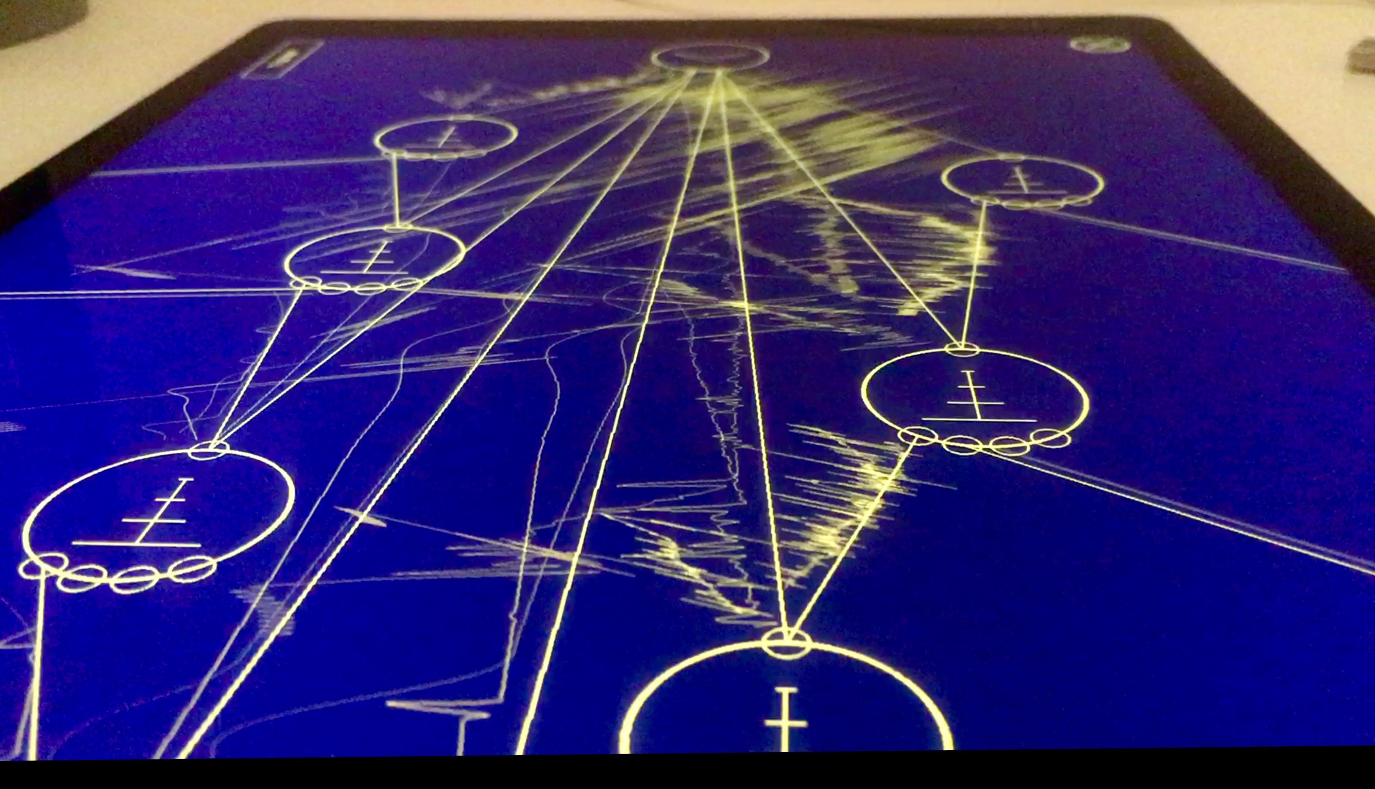
The second song, PULSE, comprised three sections. It began with a low bass note of fixed pitch that sounded every two seconds or so, feeding into a cascade of feedback delays to create a steady reverberant pulse. The delay lengths were then modulated with low frequency oscillators, introducing noisy whirs and other sonic artifacts. Over this a slow melody, loosely in tune with the bass pulse, was then constructed. The second section began by dropping the delay modulations and the melody; the bass drone was switched to a sequenced bass line and the tempo was doubled. Over this, melodic activity similar to that from before was then reintroduced, but this time sounding on every offbeat eighth note (in a conceptual sense, as Auraglyph at the time had no way of representing standard Western note durations). In the third section, the melody was again removed and the bass pulse from before restored in conjunction with the addition of many more feedback delays. These were cascaded, delay-modulated, and ring modulated to create a chaotic soundscape of noises, obscuring but not eradicating the piece’s starting point. Figure 1.10 shows an Auraglyph program in the midst of this process.
The process of developing these compositions uncovered software bugs
that needed to be fixed before the musical works could be safely
performed in front of an audience without fear of a malfunction or
crash. One such bug rendered audio nodes inoperative if all of their
connections were removed. Another bug caused the Feedback
node to crash if its delay parameter was modulated below 0;
this corresponded to a non-sensical delay of negative duration, but
crashing was and is considered a poor response to out-of-range input. A
cluster of bugs related to the breakdown and cleanup of internal data
structures of one program before loading another. The unreliability of
the numeric handwriting recognition necessitated additional training
examples of input numerals. Fortunately, all of these issues were abated
prior to the performance.
The author’s set at TOO LATE IV was the first public performance of music created with Auraglyph (Figure 1.11). It consisted mostly of music created with the two prearranged Auraglyph programs interspersed with a ChucK program running on a laptop and controlled by the laptop’s trackpad. The author concluded his set by intentionally connecting nodes in a way that caused audio to glitch and break down into silence. The performance was warmly received, described afterwards by one audience member as “fire drones” whereas another was amazed that “an iPad could make sounds like that.” One individual present at the show, who identified herself as a visual artist, suggested projecting the iPad visuals during performance due to their interestingness in relation to the audio. As has become standard at performances involving Auraglyph, a number of individuals asked when they could get copies of the software for their own use. Overall the author was satisfied with the work that had been constructed over the previous weeks and performed at the concert.

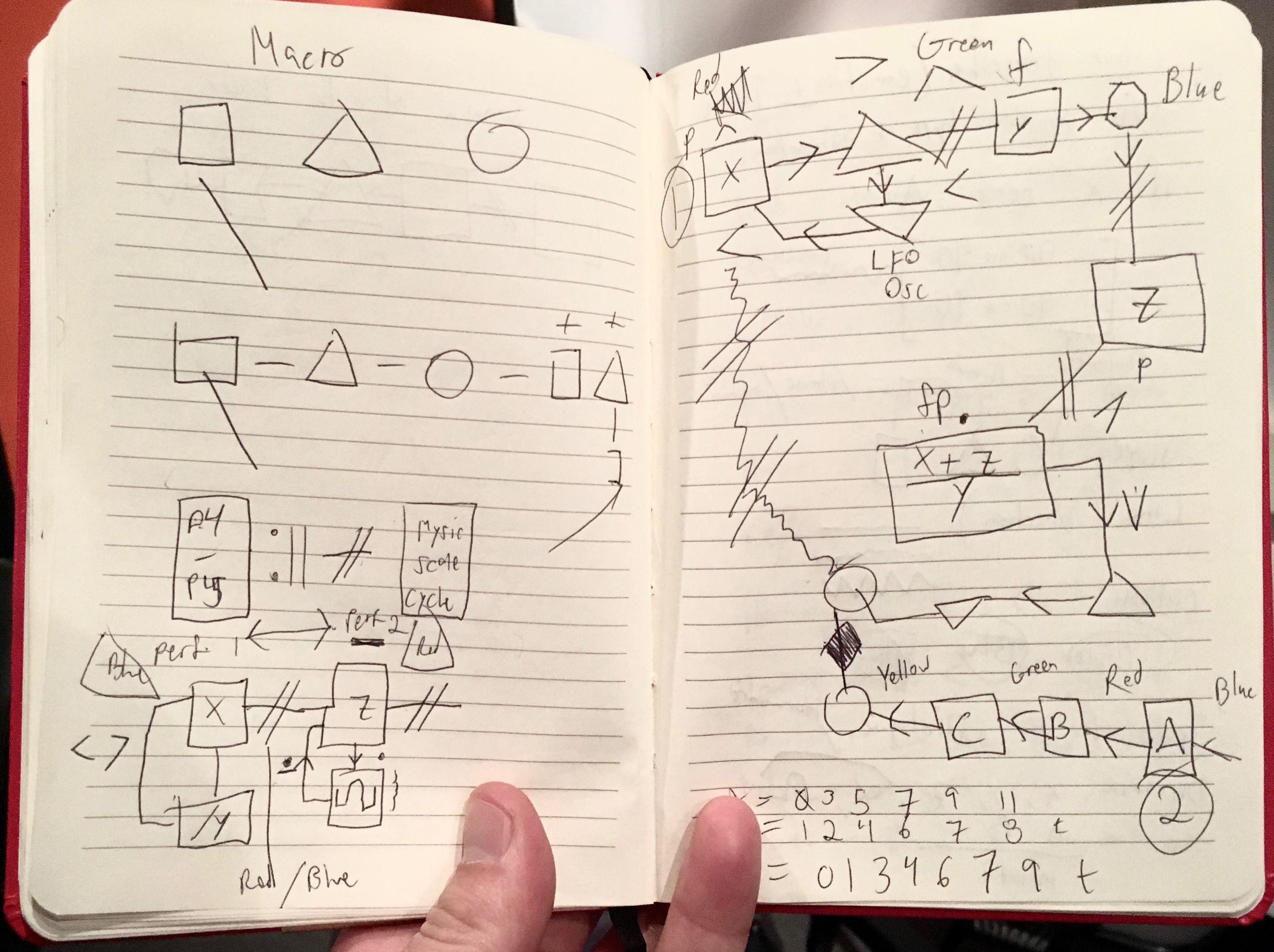
Crucially, distinct advantages of the Auraglyph paradigm made themselves apparent through this exercise. As a performer and composer, it was empowering to be able to work in an environment where low-level sound design, high-level composition, and gestural control were completely integrated into a cohesive framework. It was also liberating working directly with MIDI notes, frequencies, delay times, and amplitudes. Abstracted from the particular rules of Western music theory, these raw values allowed the author to reason analytically about the relationships within a piece of music in a way that had previously eluded him in conventional music making. Pulled apart from white keys and black keys, detached from staffs and clefs, an inner musical order within the author was empowered to manifest itself.
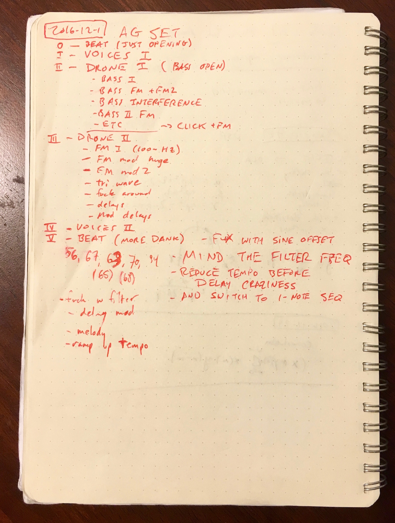
Working with Auraglyph was also interesting in the context of Trueman’s concept of performative attention [6], or more generally how much work must be done to achieve a desired musical result. Performing these pieces was a combination of parameterizing and reconfiguring a pre-made patch in addition to extending that patch with new nodes and connections, or creating a new patch from scratch. This required documentation of the procedures needed to progress a piece as planned, and careful execution of these instructions. The “score” for the author’s performance can be seen in Figure 1.12. Rather than simply running prearranged buffers of code or triggering loops, significant parts of the program had to be built live during the performance in a process similar to live coding. Performing with Auraglyph required a mentally active process of recreating a program based on a model designed and rehearsed prior to the performance. This left room for plenty of mistakes to be made; instructions in all-capital letters in the score in Figure 1.12 were largely warnings of pitfalls in this process that would lead to undesirable musical results. In an extreme case, “MIND THE FILTER FREQ” warns to ensure that a filter frequency is not modulated below zero, which due to a software bug would have caused it to short-circuit the entire audio path.5
Multitouch interaction was especially helpful in the process of performing with Auraglyph. At times, progressing to the next part of a piece required making or breaking two connections at the same time. The gesture to make or break a connection is only finalized when the finger or pen that began it is lifted from the screen, so multiple fingers can prepare these gestures and then activate them simultaneously by lifting the hand(s) from the screen.
Composing with Auraglyph also revealed some of the software’s distinct shortcomings and potential enhancements. The most significant of these was the difficulty of changing between two or more discrete states, for instance when dynamically alternating between notes in performing the melody of PULSE. In the melodic sections of PULSE, changes of individual notes were effected by directly writing in the MIDI note numbers corresponding to the desired pitch. This process was cumbersome and prone to error under the pressure of a concert scenario and with the uneven performance of Auraglyph’s numeric handwriting recognition, but, lacking some sort of on-screen musical keyboard or similar interface, there was no alternative. This difficulty mostly presented itself in the context of performing live with Auraglyph. In contrast, when developing a patch offline it is not usually a problem if it takes an extra half second to enter in the desired value for a parameter.
Several issues with the Sequencer node were uncovered
during this experiment as well. The most apparent of these was the
inability to lock sequencer steps to values of the desired quanta, for
instance, to a specific discrete MIDI pitch. Rather, the sequencer was
designed so that each step could emit a value in a fixed range from zero
to one. In the interest of versatility, the resolution within that range
was proportional to the resolution of the touchscreen itself, and not
quantized to any particularly musically relevant scale. When mapping
these values to MIDI note numberings, it was easy to get fractional
pitches that would be undesirably dissonant. This was problematic in the
context of PULSE, in which melodic notes were adjusted over
time with a Sequencer node, and fractional pitches had the
potential to clash with previous notes in the melody and with the bass
pulse. The sequencer was further limited in this exercise by its
inability to set durations of notes using it. Instead, notes in the
sequencer lasted through the full duration of each beat, only triggering
the envelope to release if the next beat was completely off.
It further occurred to the author that perhaps he was not using Auraglyph’s sequencer correctly, despite being the sole designer and developer of it. Instead of programming a melody on a single sequencer row, which in PULSE led to fractional pitches, perhaps a piano roll-like system would have worked better, in which each row of the sequencer corresponds to a unique pitch and the value of a given step in a row is mapped to velocity or ignored.
Interpretation
A number of interpretations can be made from the evaluations of miniAudicle for iPad and Auraglyph described herein. Informally, when given the option between the later revision of Auraglyph and miniAudicle for iPad, most people seem to naturally gravitate towards Auraglyph if they haven’t used either. It is also clear that software reliability is crucial to achieving the greater goals of a creative software application. Auraglyph fared quite poorly in its first user study, in no small part due to its smattering of software bugs and crashes. The bugs that remained in Auraglyph through the second user study also caused vexation for participants in that study.
Related to this, these studies indicate that a number of basic practical features can greatly improve the extent to which creative experimentation and exploration is possible in a software application. Based on these results, it is reasonable to conclude that save, load, and new document creation functions greatly enhanced the music-making experience for the second group of Auraglyph users. Participants in the second user study expressed anxiety about accidentally deleting their patches by hitting “New” when they meant “Save;” this anxiety forced those users to be more protective of their existing work to the detriment of further developing alternative ideas.
Users also indicated an interest in having features like undo, save as (or save a copy), copy, and paste, which were not present in Auraglyph during the user studies. These basic features provide a sense of forgiveness, enabling users to explore a broad set of creative ideas without fear of losing previous work or getting stuck in a direction that turned out to be a dead end. Other creative software development environments, such as the Audicle [10] and Field [3], have recognized this and include built-in forms of version control for managing and recalling changes to program code over time.
The physicality of using Auraglyph and miniAudicle for iPad also seemed to be an important factor to many participants in the user studies. The movement of the iPad in space played a critical role in HedonismBot, both in the performers’ “playing” the feedback between the device and the speaker and carrying the devices to the titular robot. In the case of both miniAudicle for iPad and Auraglyph, participants in the user studies created instruments that utilized the iPad’s orientation sensors to control sound synthesis. Feedback from users hinted at different mental approaches to a tablet compared to a conventional computer, ranging from a “laid-back experience,” a “toy,” and “fun.”
Most importantly, we believe the these studies offer firm evidence of the power of visual and interaction design in creative software. Strong design can make people want to use software for its own sake, allowing them to enjoy the process of understanding and applying complex ideas while exploring a creative space. At times while developing an idea in Auraglyph, the author would simply gaze at the waveforms flying around, fascinated by their elemental beauty, independent of the audible result. It was fun just to sit back and watch and listen to what had been created, even if it wasn’t musically meaningful. Students in the “Composing with Mobile Technology” workshop were captivated by the software for extended periods of time, reportedly until the early morning in a few instances.
Auraglyph makes a number of distinctive visual design decisions—the simplistic line graphics, the windows that fold and unfold in a unique animation, the smooth pulses that travel between control nodes—that provide arguable functional benefit but are intended to provide small bits of ancillary satisfaction to the user as they develop their program. Significant effort was spent implementing these and other design elements (for instance, several weeks of development were dedicated to font rendering alone). That effort could have been directed towards more node types or more advanced synthesis models, but we feel it was well spent as it was; the visual character and the way software feels is as crucial as its functionality.
Visual design is not limited to purely cosmetic tweaks. The waveform display serves both as a visual decoration and as a tool for seeing how each node affects the audio signal, and the control signal pulses, while rendered in a visually unique way, serve as an important indicator of an Auraglyph program’s state. These features of Auraglyph were widely cited as positive aspects of working with the software.
Perhaps the most critical component of the design is the interactions themselves, how a series of touches or stylus strokes map to a resulting state of the software. Participants in the user studies for Auraglyph appreciated the sketch-oriented, stream of consciousness approach to designing musical programs (so long as the handwriting recognition actually worked). Auraglyph was compared favorably in some aspects to similar software such as Pure Data, Reaktor, or digital audio workstations; despite having far less functionality than these systems, Auraglyph succeeded at presenting the functions it did have in an approachable and inviting way. When users speak of the diverse sonic possibilities and so-called “destructive creativity” that Auraglyph enables, they don’t mean that Auraglyph implements some fundamentally different way of achieving audio synthesis or music composition. On the contrary, its fairly basic set of operators consists chiefly of standard waveforms, basic filters, an ADSR envelope, delay, and white noise. Rather, the way that these basic elements are presented and how users are guided to interact with them—the design of the software—suggests these broad sonic capabilities and interactions.
References
Copyright (c) 2017, 2023 by Spencer Salazar. All rights reserved.